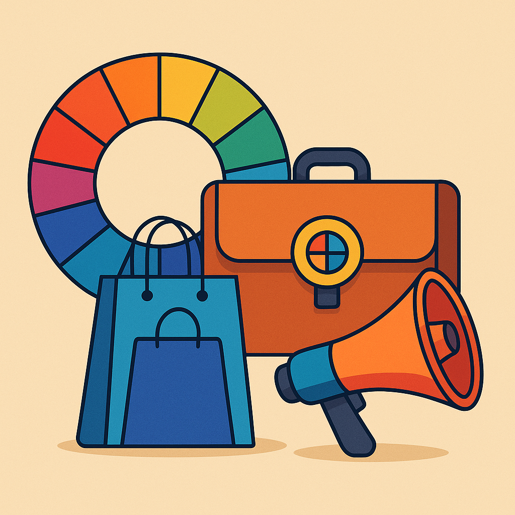
Color is more than just aesthetics. In branding and marketing, color is strategy. The psychology of colors in branding and marketing is not a new concept, but it has become increasingly important as brands compete for attention in oversaturated digital spaces.
Recent trends show that color is now part of a broader brand identity strategy—not just about standing out, but about connecting emotionally with specific audiences. And as consumer behaviors shift, marketers are rethinking their color palettes to keep pace.

Why Color Psychology Still Matters in 2025
Research from the University of Winnipeg found that people make up their minds about a product within 90 seconds of initial interaction, and up to 90% of that assessment is based on color alone (Satyendra Singh, Management Decision Journal).
In a world where attention spans are shrinking and brand loyalty is fleeting, leveraging the psychology of colors in branding and marketing gives businesses a cognitive edge. The right color triggers emotional associations, builds recognition, and subtly persuades consumers without a word being spoken.
Color Associations That Drive Decisions
Each color communicates something different, even before the first slogan or call to action:
- Red – urgency, energy, passion. Often used for sales and fast food.
- Blue – trust, calm, security. Common in banking, tech, and healthcare.
- Green – nature, growth, health. Popular in wellness, sustainability, and finance.
- Yellow – optimism, friendliness, caution. Used to attract attention.
- Black – luxury, sophistication, authority. Fashion and premium brands love it.
- Purple – creativity, spirituality, royalty. Great for beauty or high-end niche markets.
- Orange – enthusiasm, confidence, affordability. Often used in retail.
However, these associations are not universal. They’re heavily influenced by culture, context, and even generational preferences. A green logo in the U.S. might suggest eco-friendliness. In China, it can imply infidelity. Understanding audience context is crucial.
Emerging Trends in Color Use for Branding
As visual marketing becomes more personalized, color strategies are evolving in fascinating ways. Here are a few notable trends:
1. Color Minimalism with Bold Accents
Gone are the days of color explosions. Brands are opting for clean, muted palettes with one or two bold hues that drive attention to CTAs or packaging details. This approach reflects digital fatigue and the growing preference for simplicity.
2. Adaptive Color Schemes for Dark Mode
With mobile-first design becoming the standard, color palettes are now being tested across light and dark modes. Instagram and Spotify are already ahead of the curve, adapting brand hues that retain visibility and emotional impact in both versions.
3. Inclusive and Neurodiverse Color Design
More brands are factoring in color blindness and neurodivergence. Google’s Material Design guidelines, for instance, emphasize color contrast and accessibility to ensure inclusivity without sacrificing branding impact.
4. Generational Color Preferences
Gen Z gravitates toward soft, expressive colors like lavender, mint, and peach—tones that feel honest and emotionally resonant. In contrast, Gen X prefers bolder contrasts that reflect certainty and clarity. Smart marketers tailor color use depending on the age group they’re targeting.
How to Apply the Psychology of Colors in Your Marketing Strategy
If you’re building or revamping a brand, color is not a secondary decision—it’s foundational. Here’s how to apply the psychology of colors in branding and marketing effectively:
1. Know Your Audience
Different demographics respond to color differently. Are you targeting Gen Z digital natives? Or Boomers with established brand loyalties? Your palette needs to align with their emotional language.
2. Study Your Competitors
Use tools like Coolors, Adobe Color, or Semrush’s Brand Monitoring to identify color gaps in your niche. Standing out in a saturated market often starts with avoiding the color everyone else is using.
3. Design for Context and Platform
A color that works beautifully on a physical product may look washed out on mobile. Always test your palette across devices, backgrounds, and media types.
4. Keep Accessibility Front and Center
Use high contrast ratios. Avoid color pairings that are problematic for those with color vision deficiency. Brands that ignore accessibility lose not just customers but credibility.
5. Use Data to Iterate
A/B test color variations on landing pages, CTAs, or product packaging. Track metrics like bounce rate, conversion rate, and average session duration to see what’s working.
Real-World Examples: Who’s Doing Color Right?
- Spotify: Uses vibrant green against a dark background to create a sense of energy and focus. Their color palette adapts seamlessly across mobile and desktop.
- Glossier: Leverages soft pinks and clean white space to communicate approachability and self-expression. This color scheme resonates with younger, digitally native audiences.
- Slack: Uses a four-color hashtag logo to reflect collaboration and diversity. Their updated color palette ensures legibility across dark mode and light interfaces.
Conclusion
Color isn’t just about what looks good—it’s about what feels right, resonates emotionally, and performs well across digital platforms. The psychology of colors in branding and marketing will continue to evolve, especially as consumer expectations shift toward inclusivity, simplicity, and personalization.
Brands that pay attention to emerging color psychology trends—not just traditional color theory—will have a powerful, unspoken advantage in connecting with audiences.
Cited and Recommended References
- Satyendra Singh (2006)
Impact of color on marketing – Management Decision, Vol. 44 No. 6, pp. 783-789
https://doi.org/10.1108/00251740610673332 - Google Material Design Guidelines – Color
https://m3.material.io/styles/color - Adobe Color Trends 2024 Report
https://blog.adobe.com/en/publish/2023/12/05/color-trends-2024


