The digital world is ever-evolving, and as technology continues to advance, users’ expectations for app design are becoming more refined. One trend that has gained significant traction in recent years is the rise of minimal app layouts. While minimalism in design is not a new concept, its application in mobile and web apps has been revolutionary in terms of user experience and functionality. But why are minimal layouts such a big deal? In this article, we’ll explore the reasons behind the shift towards minimalist app designs and how, consequently, this trend is shaping the future of mobile applications.
The Core of Minimal App Layouts
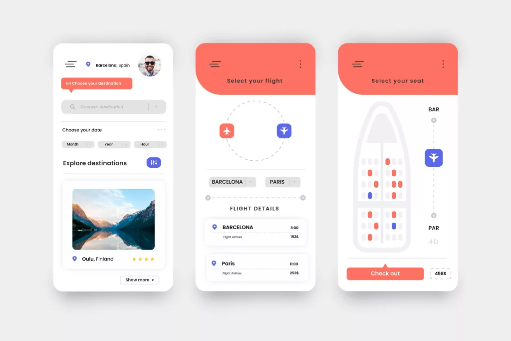
At its core, minimal app layout design is about stripping away unnecessary elements to focus on simplicity and clarity. Essentially, it’s about making the user’s journey through the app as straightforward and intuitive as possible. By removing distractions and clutter, the design allows users to easily navigate and interact with the app without feeling overwhelmed. Consequently, this streamlined approach enhances the overall user experience, making it more efficient and enjoyable. Rather than overwhelming the user with too many buttons, flashy graphics, or excessive text, minimalism focuses on providing only what’s necessary, exactly when it’s needed.
But this isn’t about just making things look “clean” or “neat.” Minimalism is, therefore, a strategic design philosophy that primarily focuses on creating an efficient, user-friendly interface. It enhances usability, promotes faster interactions, and delivers a better overall user experience. Increasing user demands for apps that are easier to navigate, load quickly, and offer clear, meaningful interactions have spurred this design shift. As a result, developers have begun focusing more on minimalist design principles to meet these expectations. Furthermore, minimal layouts not only improve usability but also enhance performance, making them a crucial part of modern app design. Consequently, this shift is influencing how both users and designers view the value of simplicity in app interfaces.
Why Minimal Layouts are Gaining Popularity
1. Faster Performance and Loading Times
Minimal app layouts improve app performance as one of their primary benefits. Fewer elements on a screen means less data needs to load, resulting in faster performance and quicker load times. According to a report from Google, users are likely to abandon an app if it takes more than three seconds to load. In a world where speed is crucial, minimalism ensures that apps perform efficiently and retain user attention.
In addition to improved speed, minimal designs often require less processing power, which can benefit users on older devices or those with limited network bandwidth. Apps that load quickly and respond smoothly are more likely to keep users engaged, reducing abandonment rates.
2. Simplified User Experience
User experience (UX) is central to app design, and minimal layouts excel in creating intuitive and frictionless experiences. By eliminating unnecessary features and elements, the interface becomes less cluttered, allowing users to focus on what matters most.
Minimal designs streamline navigation and reduce cognitive load. Rather than searching through endless menus or buttons, users are presented with clear, actionable items. For example, a prominent call-to-action button or an easy-to-find search bar makes it easier for users to interact with the app.
The simplicity of a minimal design also reduces the likelihood of user errors. With fewer distractions and less on-screen information, users can navigate the app with more confidence and precision.
3. Increased Focus on Content
In minimal app layouts, content takes center stage. With distractions reduced to a minimum, users can focus on the key content that the app is designed to deliver. Whether it’s a social media feed, an e-commerce platform, or a productivity tool, the minimalist design ensures that users can easily access and interact with content without being overwhelmed by unnecessary visual elements.
For example, Instagram’s app is a perfect case study of how a minimal layout can work effectively. The app’s design focuses primarily on images and videos, while the features and functions remain simple and intuitive. Users can quickly scroll through their feed or interact with posts without being distracted by unnecessary elements.
4. Improved Visual Appeal
While minimal designs are focused on functionality, they also offer significant visual appeal. The use of white space, clear typography, and simple icons can create a calming, visually appealing interface. White space, or negative space, plays a pivotal role in minimal app layouts, offering a sense of openness and clarity.
When done well, minimalism allows apps to look modern, elegant, and aesthetically pleasing. By focusing on the essential elements, designers can create an interface that feels fresh and uncluttered. This simplicity can lead to a more enjoyable experience for the user, as the design doesn’t overwhelm them with excess.
5. Future-Proofing for Multi-Device Use
As the digital ecosystem evolves, apps need to be adaptable to various screen sizes and device types. Minimal designs are inherently more flexible, making them well-suited for different platforms, from smartphones to tablets to wearables. A minimalist approach ensures that the app’s core functionality remains intact across all devices, providing a consistent user experience.
With the growing demand for wearable devices like smartwatches, designers must consider how their apps will display on smaller screens. Minimal layouts, which focus on essential functions, translate well to these compact devices, ensuring that users can still interact with the app efficiently.
Trends and Examples of Minimal Layouts in Modern Apps
1. Apple iOS and Material Design
Apple’s iOS design philosophy has embraced minimalism for years. The operating system’s clean and intuitive interface, with its focus on simple icons, clear typography, and smooth animations, provides users with a seamless experience. The minimalist design elements allow users to navigate through their apps effortlessly, whether it’s a native app or a third-party one.
Similarly, Google’s Material Design, which has been widely adopted by Android apps, emphasizes minimal design principles, such as bold typography, subtle animations, and a focus on user interaction. Material Design makes use of layers and shadows to create depth while maintaining a clean, uncluttered interface.
2. Social Media Apps and Minimalism
Social media platforms like Twitter, Instagram, and Pinterest have all adopted minimalist layouts in recent years. Each of these platforms emphasizes content—be it images, posts, or videos—while keeping navigation simple and easy to understand.
Instagram, in particular, stands out for its minimalistic approach, which allows users to focus on visual content with a clean interface that minimizes distractions. With a simple color scheme and intuitive icons, Instagram has successfully blended aesthetic appeal with user-friendly design.
3. E-Commerce Apps and Minimalism
E-commerce apps have also embraced minimalism, using clean layouts to present product images, descriptions, and pricing without overwhelming users with too much information. Brands like Apple and Amazon employ minimal designs that showcase their products without excess clutter. The minimal approach makes it easier for users to browse and make purchase decisions quickly, leading to higher conversion rates.
How to Implement a Minimal Layout in Your App Design
If you’re looking to adopt a minimalist design for your app, here are a few practical tips to get started:
- Prioritize Content: Focus on the most important elements that drive the core function of your app. Whether it’s an action button or a key piece of content, make sure these elements are easy to access and interact with.
- Use Negative Space: Don’t be afraid of empty space. White space can help break up content, making the interface feel less cluttered and more digestible.
- Simplify Navigation: Limit the number of menus and buttons. Aim for a single, intuitive navigation path that makes it easy for users to find what they need.
- Choose Clear Typography and Icons: Use simple, readable fonts and easily recognizable icons. These elements should serve a functional purpose, guiding users toward actions.
- Reduce Visual Distractions: Eliminate unnecessary animations, borders, and heavy graphics that distract from the core content.
Conclusion
Minimal app layouts are not just a design trend—they’re a shift towards more user-centric, efficient, and visually appealing app experiences. By focusing on what’s essential, removing distractions, and prioritizing speed and usability, minimal designs are reshaping the way users interact with their apps. As mobile technology continues to advance and users demand faster, more intuitive experiences, the minimalist approach will remain a cornerstone of effective app design.
By embracing minimalism, app developers can create interfaces that are not only aesthetically pleasing but also enhance user satisfaction and retention. In the fast-paced world of tech, where user attention is fleeting and competition is fierce, minimal app layouts offer a strategic advantage that shouldn’t be overlooked.
References
- Google Webmasters Blog (2023) Why does speed matter?. Available at: https://developers.google.com (Accessed: 17 July 2025).
- Nielsen Norman Group (2024) 10 Usability Heuristics for User Interface Design. Available at: https://www.nngroup.com (Accessed: 17 July 2025).
- Adobe Blog (2020) The rise of minimalist design. Available at: https://blog.adobe.com (Accessed: 17 July 2025).