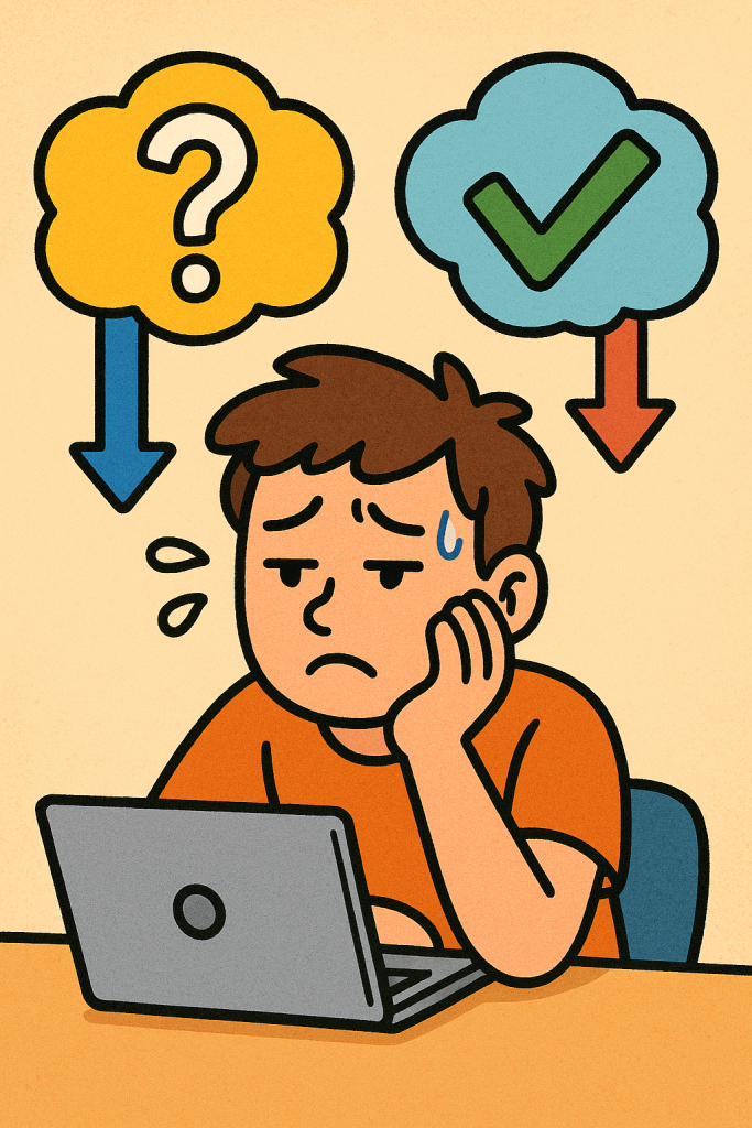
Decision fatigue strikes when prolonged decision-making wears down our mental energy. Designing smart defaults—pre‑selected options tailored to user behavior—can dramatically reduce this burden. In this guide, you’ll discover how defaults help simplify choices, why they work, and how to implement them effectively.

Why “designing defaults to limit decision fatigue” matters
Humans have limited cognitive resources—and every choice, even trivial ones, depletes them. As choices accumulate, the brain shifts toward shortcuts or avoidance (like default options). By designing defaults to limit decision fatigue, we proactively reduce decision load, letting people focus where it matters most.
How default settings tame choice overload
1. Defaults tap into cognitive inertia.
Years of behavioral science show that people generally stick with what’s pre-selected—aka the “default effect”. That means well-designed defaults nudge users toward good decisions without forcing them.
2. Fewer choices = fewer mistakes.
Hick’s Law reminds us: more options slows decision-making. Defaults reduce required steps—no more sifting through menus or toggles.
3. Defaults signal guidance.
Seeing a pre‑chosen recommendation is perceived as expert advice. Users perceive it as a helpful guide rather than bias—which builds trust .
Emerging trend: Personalization meets default design
Modern products are shifting from static defaults to personalized, adaptive defaults:
| Approach | Description | Example |
|---|---|---|
| Static default | One-size-fits-most option, e.g., highest plan | Annual billing pre‑selected |
| Persistent default | Remembers the user’s previous choice | Language locale auto‑saved |
| Smart default | Uses data to predict best choice | Spotify pre‑selecting “Release Radar” playlist |
| Adaptive default | Adjusts in real-time based on behavior | Form autocompletion based on recent inputs |
These trends echo findings from nudge theory: personalized defaults increase uptake and satisfaction by aligning with user context and preferences.
A 5-step guide to designing helpful defaults
1. Audit decision-heavy flows
Scan where users face multiple options—pricing, onboarding forms, notifications, settings. Map steps and estimate cognitive load.
2. Curate narrow, meaningful defaults
Start with top 1–3 most common or highest-value options. Present these as defaults, hiding less important choices.
Example: Onboarding survey with 2–3 simplified choices rather than 10+ toggles.
3. Implement personalization
Use behavioral data or preferences to set adaptive defaults.
Example: Streaming apps pre-select language or genre based on past listening habits.
4. Support customization
Always allow users to opt-out or customize defaults. Defaults should guide, not coerce.
5. Test for friction and fatigue
Use analytics and usability tests to identify drop-offs or hesitation points. Test variants with and without defaults to measure impact on engagement or completion.
Real-world examples
- Netflix Top Picks: When users open Netflix, the “Recommended for You” section reduces browsing fatigue—streamlined viewing with minimal effort.
- Privacy opt-out dialogs: GDPR pop-ups with “Accept all” pre‑checked default to higher consent rates—but may reduce clarity and invite regret if not transparent .
- Organ donor systems: European countries that use opt‑out defaults for donor registration see significantly higher participation rates.
Practical tips for designers and product leaders
- Combine defaults with progressive disclosure
Display only core options by default; expose advanced ones on demand. - Use smart microcopy
Clarify why a default is chosen: “Recommended for optimal battery life” and “You can change this anytime.” - Apply defaults to recurring workflows
Email settings, weekly digest frequency, or meal choices—defaults save constant re-selection. - Mobile-first defaults
On small screens, defaults reduce decision strain and help navigation flow.
Avoiding pitfalls: ethics and overreach
- Transparency is essential
Hidden or coercive defaults may erode user trust. - One-size defaults can backfire
Defaults misaligned with user goals cause frustration—always allow choice flexibility. - Monitoring matters
Behavioral fatigue, UX drop-offs, negative feedback—keep an eye out. Defaults should reduce friction, not create confusion.
Tracking success: key metrics to monitor
- Form completion rate
- Time-on-task reduction
- Engagement lift (e.g., email opens, playlist plays)
- Opt-out frequency after default acceptance
- User sentiment surveys
Positive movement in these stats indicates defaults are reducing decision effort and increasing satisfaction.
Beyond UX: organizational well-being benefits
Good default design isn’t just user-friendly—it helps organizations:
- Employees feel less overwhelmed due to internal streamlining.
- Leaders preserve mental bandwidth, avoiding burnout, especially in high-stake roles.
- Better outcomes in critical domains, from scheduling to clinical decisions—making well-chosen defaults can improve staff morale and decision quality .
Summary
Designing defaults to limit decision fatigue is a powerful UX strategy grounded in behavioral science. By implementing well-chosen, transparent defaults, you can reduce cognitive burden, support user goals, and drive engagement. As personalization becomes mainstream, consider adaptive defaults that anticipate needs—but always leave the door open for customization. When done right, it’s a win-win for users and teams alike.
References
Wikipedia contributors. Default effect. Wikipedia, The Free Encyclopedia. (Last revised May 2025).
Retrieved from Default effect – Wikipedia.
Vonasch, A., Vohs, K. D., Baumeister, R. F., Pocheptsova, A., & Dhar, R. (2015). Decision Fatigue, Choosing for Others, and Self‑Construal. Social Psychological and Personality Science, 7(5), 471–478. Retrieved from Decision Fatigue, Choosing for Others… en.wikipedia.org
Lin, Y.-C. (June 13, 2025). What Is Decision Fatigue? How It Impacts Consumer Behaviour and Marketing. Cognitive‑Clicks Blog. Retrieved from Cognitive‑Clicks: What Is Decision Fatigue?


